| Type: | Package |
| Title: | Chart Generation for 'Microsoft Word' and 'Microsoft PowerPoint' Documents |
| Version: | 0.4.1 |
| Description: | Create native charts for 'Microsoft PowerPoint' and 'Microsoft Word' documents. These can then be edited and annotated. Functions are provided to let users create charts, modify and format their content. The chart's underlying data is automatically saved within the 'Word' document or 'PowerPoint' presentation. It extends package 'officer' that does not contain any feature for 'Microsoft' native charts production. |
| License: | MIT + file LICENSE |
| Encoding: | UTF-8 |
| LazyData: | true |
| Depends: | R (≥ 2.10) |
| Imports: | stats, data.table, officer (≥ 0.3.6), cellranger, writexl, grDevices, xml2 (≥ 1.1.0), htmltools, utils, scales |
| URL: | https://ardata-fr.github.io/officeverse/, https://ardata-fr.github.io/mschart/ |
| BugReports: | https://github.com/ardata-fr/mschart/issues |
| RoxygenNote: | 7.3.2 |
| Suggests: | tinytest, doconv |
| NeedsCompilation: | no |
| Packaged: | 2025-08-18 13:54:44 UTC; davidgohel |
| Author: | David Gohel [aut, cre], ArData [cph], YouGov [fnd], Jan Marvin Garbuszus [ctb] (support for openxls2), Stefan Moog [ctb] (support to set chart and plot area color and border), Eli Daniels [ctb], Marlon Molina [ctb] (added table feature), Rokas Klydzia [ctb] (custom labels), David Camposeco [ctb] (chart_data_smooth function), Dan Joplin [ctb] (fix scatter plot data structure) |
| Maintainer: | David Gohel <david.gohel@ardata.fr> |
| Repository: | CRAN |
| Date/Publication: | 2025-08-18 15:20:02 UTC |
Chart Generation for 'Microsoft Word' and 'Microsoft PowerPoint' Documents
Description
It lets R users to create Microsoft Office charts from data, and then add title, legends, and annotations to the chart object.
The graph produced is a Microsoft graph, which means that it can be edited in your Microsoft software and that the underlying data are available.
The package will not allow you to make the same charts as with ggplot2. It allows only a subset of the charts possible with 'Office Chart'. The package is often used to industrialize graphs that are then consumed and annotated by non-R users.
The following charts are the only available from all possible MS charts:
barcharts:
ms_barchart()line charts:
ms_linechart()scatter plots:
ms_scatterchart()area charts:
ms_areachart()
These functions are creating a 'chart' object, it can be customized;
by using options specific to the chart (with
chart_settings()),by changing the options related to the axes (with
chart_ax_x()andchart_ax_y()),by changing the options related to the labels (with
chart_data_labels()),by changing the colors, line widths, ... with functions
by changing the general theme with function
chart_theme(),by changing the title labels with function
chart_labels().
You can add a chart into a slide in PowerPoint with function ph_with.ms_chart().
You can add a chart into a Word document with function body_add_chart().
Author(s)
Maintainer: David Gohel david.gohel@ardata.fr
Other contributors:
ArData [copyright holder]
YouGov [funder]
Jan Marvin Garbuszus (support for openxls2) [contributor]
Stefan Moog moogs@gmx.de (support to set chart and plot area color and border) [contributor]
Eli Daniels eli.daniels@ardata.fr [contributor]
Marlon Molina (added table feature) [contributor]
Rokas Klydzia (custom labels) [contributor]
David Camposeco david.camposeco.paulsen@gmail.com (chart_data_smooth function) [contributor]
Dan Joplin (fix scatter plot data structure) [contributor]
See Also
https://ardata-fr.github.io/officeverse/
set a barchart as a stacked barchart
Description
Apply settings to an ms_barchart object to
produce a stacked barchart. Options are available to use percentage
instead of values and to choose if bars should be vertically or horizontally drawn.
Usage
as_bar_stack(x, dir = "vertical", percent = FALSE, gap_width = 50)
Arguments
x |
an |
dir |
the direction of the bars in the chart, value must one of "horizontal" or "vertical". |
percent |
should bars be in percent |
gap_width |
gap width between the bar for each category on a bar chart, in percent of the bar width. It can be set between 0 and 500. |
Examples
library(officer)
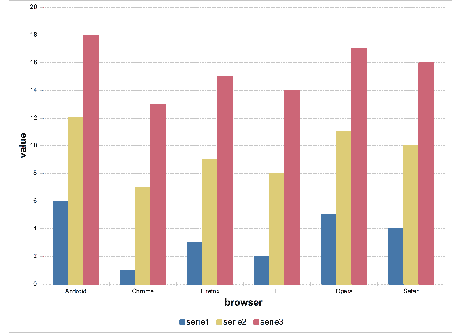
my_bar_stack_01 <- ms_barchart(data = browser_data, x = "browser",
y = "value", group = "serie")
my_bar_stack_01 <- as_bar_stack( my_bar_stack_01 )
my_bar_stack_02 <- ms_barchart(data = browser_data, x = "browser",
y = "value", group = "serie")
my_bar_stack_02 <- as_bar_stack( my_bar_stack_02, percent = TRUE,
dir = "horizontal" )
doc <- read_pptx()
doc <- add_slide(doc, layout = "Title and Content", master = "Office Theme")
doc <- ph_with(doc, my_bar_stack_02, location = ph_location_fullsize())
fileout <- tempfile(fileext = ".pptx")
print(doc, target = fileout)
add chart into a Word document
Description
add a ms_chart into an rdocx object, the graphic will be
inserted in an empty paragraph.
Usage
body_add_chart(x, chart, style = NULL, pos = "after", width = 5, height = 3)
Arguments
x |
an rdocx object |
chart |
an |
style |
paragraph style |
pos |
where to add the new element relative to the cursor, one of "after", "before", "on". |
height, width |
height and width in inches. |
Examples
library(officer)
my_barchart <- ms_barchart(data = browser_data,
  x = "browser", y = "value", group = "serie")
my_barchart <- chart_settings( my_barchart, grouping = "stacked",
  gap_width = 50, overlap = 100 )

doc <- read_docx()
doc <- body_add_chart(doc, chart = my_barchart, style = "centered")
print(doc, target = tempfile(fileext = ".docx"))
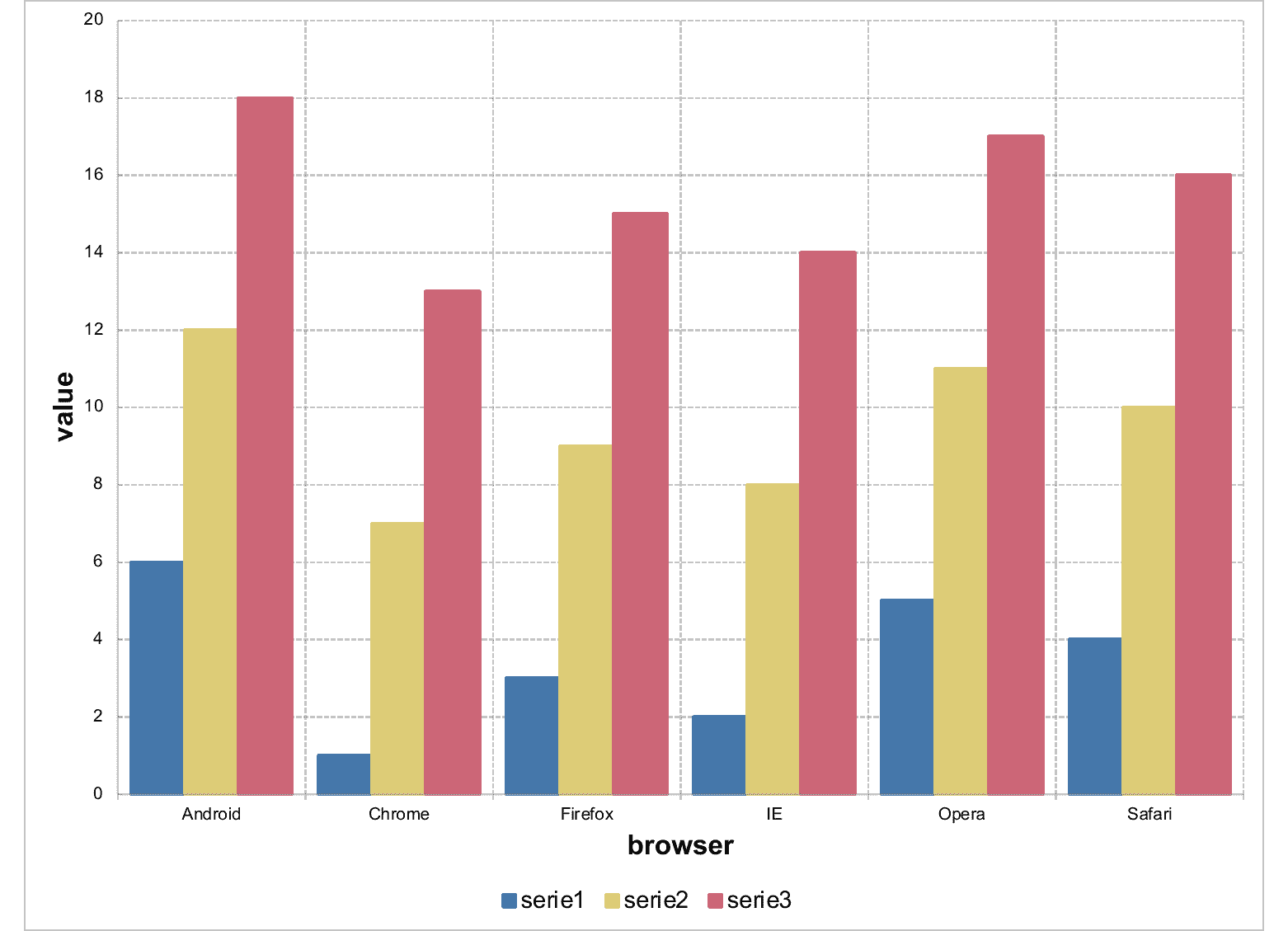
Dummy dataset for barchart
Description
A dataset containing 2 categorical and an integer variables:
Usage
data(browser_data)
Format
A data frame with 18 rows and 3 variables
Details
browser web browser
serie id of series
value integer values
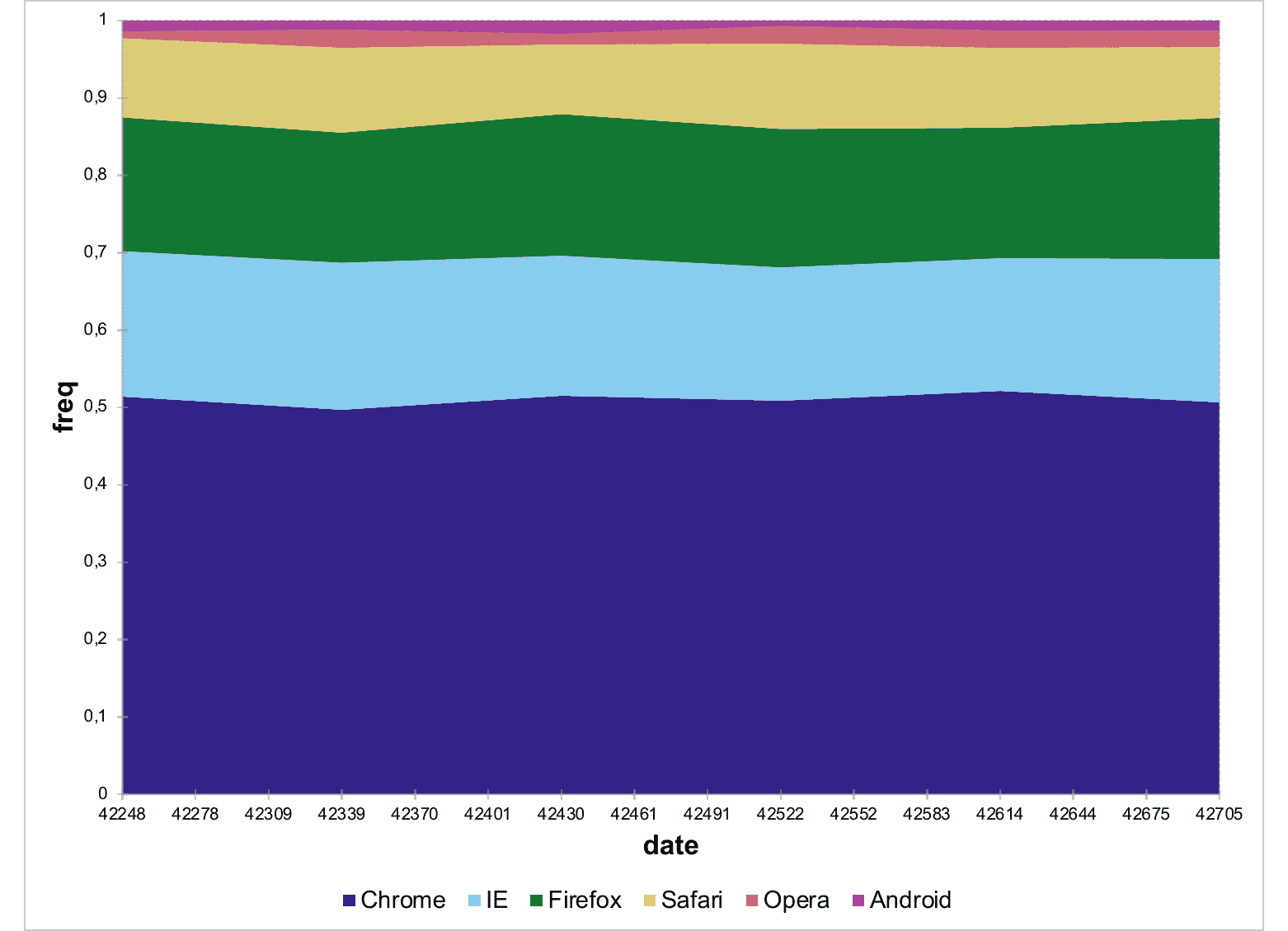
Dummy dataset for barchart
Description
A dataset containing a date, a categorical and an integer variables:
Usage
data(browser_ts)
Format
A data frame with 36 rows and 3 variables
Details
date date values
browser web browser
freq values in percent
x axis settings
Description
Define settings for an x axis.
Usage
chart_ax_x(
  x,
  orientation,
  crosses,
  cross_between,
  major_tick_mark,
  minor_tick_mark,
  tick_label_pos,
  display,
  num_fmt,
  rotation,
  limit_min,
  limit_max,
  position,
  second_axis = FALSE
)
Arguments
x |
an |
orientation |
axis orientation, one of 'maxMin', 'minMax'. |
crosses |
specifies how the axis crosses the perpendicular axis, one of 'autoZero', 'max', 'min'. |
cross_between |
specifies how the value axis crosses the category axis between categories, one of 'between', 'midCat'. |
major_tick_mark, minor_tick_mark |
tick marks position, one of 'cross', 'in', 'none', 'out'. |
tick_label_pos |
ticks labels position, one of 'high', 'low', 'nextTo', 'none'. |
display |
should the axis be displayed (a logical of length 1). |
num_fmt |
number formatting. See section for more details. |
rotation |
rotation angle. Value should be between |
limit_min |
minimum value on the axis. |
limit_max |
maximum value on the axis. |
position |
position value that cross the other axis. |
second_axis |
unused |
num_fmt
All % need to be doubled, 0%% mean "a number
and percent symbol".
From my actual knowledge, depending on some chart type
and options, the following values are not systematically
used by office chart engine; i.e. when chart pre-compute
percentages, it seems using 0%% will have no
effect.
-
General: default value -
0: display the number with no decimal -
0.00: display the number with two decimals -
0%%: display as percentages -
0.00%%: display as percentages with two digits -
#,##0 -
#,##0.00 -
0.00E+00 -
# ?/? -
# ??/?? -
mm-dd-yy -
d-mmm-yy -
d-mmm -
mmm-yy -
h:mm AM/PM -
h:mm:ss AM/PM -
h:mm -
h:mm:ss -
m/d/yy h:mm -
#,##0 ;(#,##0) -
#,##0 ;[Red](#,##0) -
#,##0.00;(#,##0.00) -
#,##0.00;[Red](#,##0.00) -
mm:ss -
[h]:mm:ss -
mmss.0 -
##0.0E+0 -
@
Illustrations
See Also
chart_ax_y(), ms_areachart(), ms_barchart(), ms_scatterchart(),
ms_linechart()
Examples
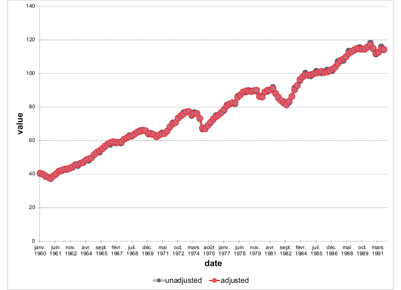
library(mschart)
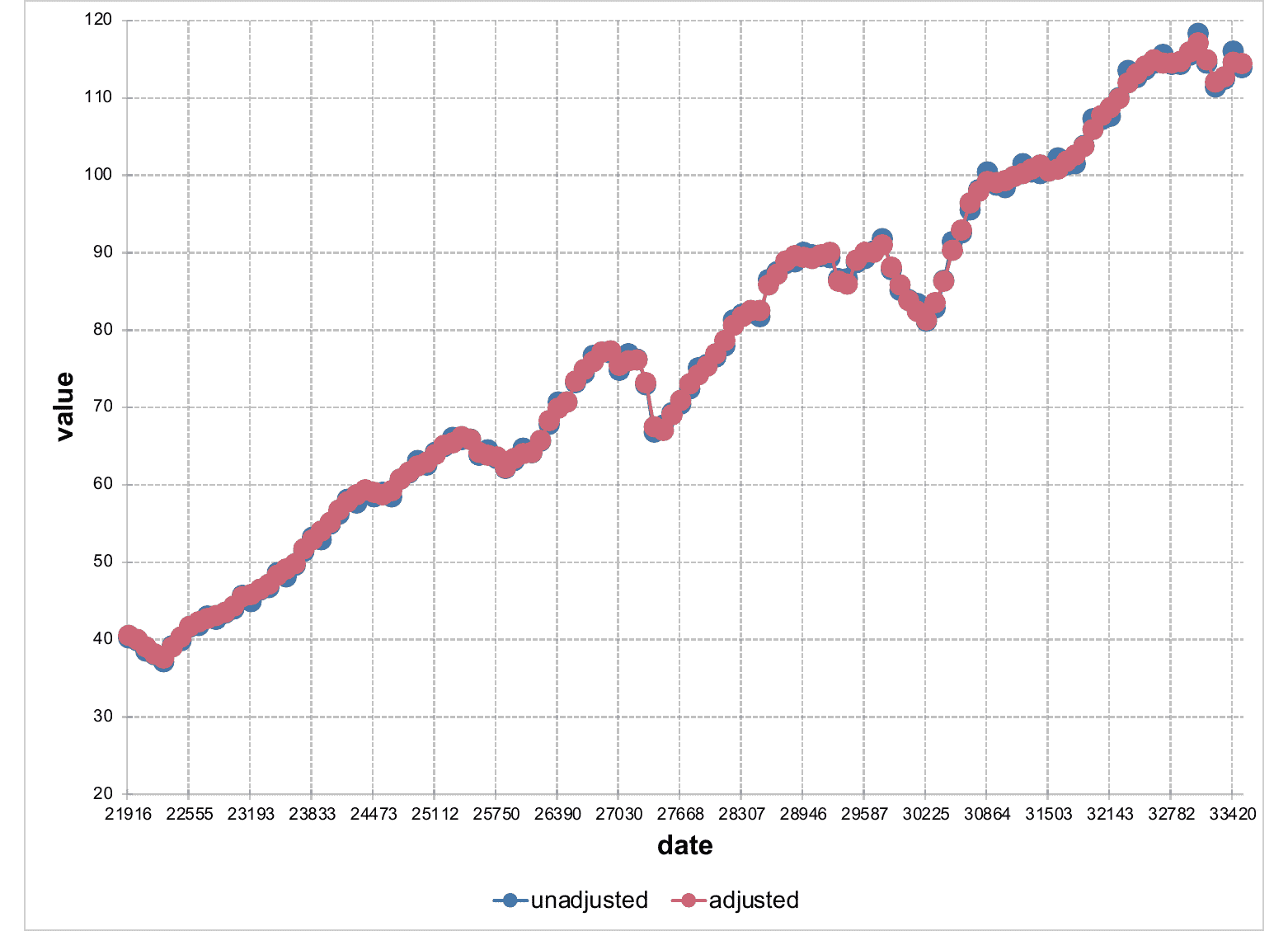
chart_01 <- ms_linechart(
data = us_indus_prod,
x = "date", y = "value",
group = "type"
)
chart_01 <- chart_ax_y(x = chart_01, limit_min = 20, limit_max = 120)
chart_01
y axis settings
Description
Define settings for a y axis.
Usage
chart_ax_y(
  x,
  orientation,
  crosses,
  cross_between,
  major_tick_mark,
  minor_tick_mark,
  tick_label_pos,
  display,
  num_fmt,
  rotation,
  limit_min,
  limit_max,
  position,
  second_axis = FALSE
)
Arguments
x |
an |
orientation |
axis orientation, one of 'maxMin', 'minMax'. |
crosses |
specifies how the axis crosses the perpendicular axis, one of 'autoZero', 'max', 'min'. |
cross_between |
specifies how the value axis crosses the category axis between categories, one of 'between', 'midCat'. |
major_tick_mark, minor_tick_mark |
tick marks position, one of 'cross', 'in', 'none', 'out'. |
tick_label_pos |
ticks labels position, one of 'high', 'low', 'nextTo', 'none'. |
display |
should the axis be displayed (a logical of length 1). |
num_fmt |
number formatting. See section for more details. |
rotation |
rotation angle. Value should be between |
limit_min |
minimum value on the axis. |
limit_max |
maximum value on the axis. |
position |
position value that cross the other axis. |
second_axis |
unused |
Illustrations
num_fmt
All % need to be doubled, 0%% mean "a number
and percent symbol".
From my actual knowledge, depending on some chart type
and options, the following values are not systematically
used by office chart engine; i.e. when chart pre-compute
percentages, it seems using 0%% will have no
effect.
-
General: default value -
0: display the number with no decimal -
0.00: display the number with two decimals -
0%%: display as percentages -
0.00%%: display as percentages with two digits -
#,##0 -
#,##0.00 -
0.00E+00 -
# ?/? -
# ??/?? -
mm-dd-yy -
d-mmm-yy -
d-mmm -
mmm-yy -
h:mm AM/PM -
h:mm:ss AM/PM -
h:mm -
h:mm:ss -
m/d/yy h:mm -
#,##0 ;(#,##0) -
#,##0 ;[Red](#,##0) -
#,##0.00;(#,##0.00) -
#,##0.00;[Red](#,##0.00) -
mm:ss -
[h]:mm:ss -
mmss.0 -
##0.0E+0 -
@
See Also
chart_ax_x(), ms_areachart(), ms_barchart(), ms_scatterchart(),
ms_linechart()
Examples
library(officer)
library(mschart)
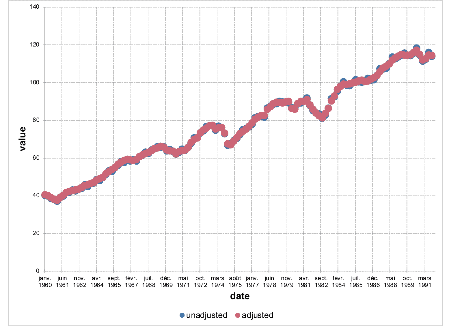
chart_01 <- ms_linechart(
data = us_indus_prod,
x = "date", y = "value",
group = "type"
)
chart_01 <- chart_settings(chart_01, style = "marker")
chart_01 <- chart_ax_x(
x = chart_01, num_fmt = "[$-fr-FR]mmm yyyy",
limit_min = min(us_indus_prod$date),
limit_max = as.Date("1992-01-01")
)
chart_01
Modify fill colour
Description
Specify mappings from levels in the data to displayed fill colours.
Usage
chart_data_fill(x, values)
Arguments
x |
an |
values |
|
See Also
Other Series customization functions:
chart_data_line_style(),
chart_data_line_width(),
chart_data_size(),
chart_data_smooth(),
chart_data_stroke(),
chart_data_symbol(),
chart_labels_text()
Examples
my_scatter <- ms_scatterchart(data = iris, x = "Sepal.Length",
  y = "Sepal.Width",  group = "Species")
my_scatter <- chart_data_fill(my_scatter,
  values = c(virginica = "#6FA2FF", versicolor = "#FF6161", setosa = "#81FF5B") )
Modify data labels settings
Description
Data labels show details about data series. This function indicate that
data labels should be displayed. See chart_labels_text() for modifying
text settings associated with labels.
Usage
chart_data_labels(
  x,
  num_fmt = "General",
  position = "ctr",
  show_legend_key = FALSE,
  show_val = FALSE,
  show_cat_name = FALSE,
  show_serie_name = FALSE,
  show_percent = FALSE,
  separator = ", "
)
Arguments
x |
an |
num_fmt |
|
position |
|
show_legend_key |
show legend key if TRUE. |
show_val |
show values if TRUE. |
show_cat_name |
show categories if TRUE. |
show_serie_name |
show names of series if TRUE. |
show_percent |
show percentages if TRUE. |
separator |
separator for displayed labels. |
Modify line style
Description
Specify mappings from levels in the data to displayed line style.
Usage
chart_data_line_style(x, values)
Arguments
x |
an |
values |
|
See Also
Other Series customization functions:
chart_data_fill(),
chart_data_line_width(),
chart_data_size(),
chart_data_smooth(),
chart_data_stroke(),
chart_data_symbol(),
chart_labels_text()
Examples
my_scatter <- ms_scatterchart(data = iris, x = "Sepal.Length",
  y = "Sepal.Width",  group = "Species")
my_scatter <- chart_data_fill(my_scatter,
  values = c(virginica = "#6FA2FF", versicolor = "#FF6161", setosa = "#81FF5B") )
my_scatter <- chart_data_stroke(my_scatter,
  values = c(virginica = "black", versicolor = "black", setosa = "black") )
my_scatter <- chart_data_symbol(my_scatter,
  values = c(virginica = "circle", versicolor = "diamond", setosa = "circle") )
my_scatter <- chart_data_line_style(my_scatter,
  values = c(virginica = "solid", versicolor = "dotted", setosa = "dashed") )
Modify line width
Description
Specify mappings from levels in the data to displayed line width between symbols.
Usage
chart_data_line_width(x, values)
Arguments
x |
an |
values |
|
See Also
Other Series customization functions:
chart_data_fill(),
chart_data_line_style(),
chart_data_size(),
chart_data_smooth(),
chart_data_stroke(),
chart_data_symbol(),
chart_labels_text()
Examples
my_scatter <- ms_scatterchart(data = iris, x = "Sepal.Length",
  y = "Sepal.Width",  group = "Species")
my_scatter <- chart_settings(my_scatter, scatterstyle = "lineMarker")
my_scatter <- chart_data_fill(my_scatter,
  values = c(virginica = "#6FA2FF", versicolor = "#FF6161", setosa = "#81FF5B") )
my_scatter <- chart_data_stroke(my_scatter,
  values = c(virginica = "black", versicolor = "black", setosa = "black") )
my_scatter <- chart_data_symbol(my_scatter,
  values = c(virginica = "circle", versicolor = "diamond", setosa = "circle") )
my_scatter <- chart_data_size(my_scatter,
  values = c(virginica = 20, versicolor = 16, setosa = 20) )
my_scatter <- chart_data_line_width(my_scatter,
  values = c(virginica = 2, versicolor = 3, setosa = 6) )
Modify symbol size
Description
Specify mappings from levels in the data to displayed size of symbols.
Usage
chart_data_size(x, values)
Arguments
x |
an |
values |
|
See Also
Other Series customization functions:
chart_data_fill(),
chart_data_line_style(),
chart_data_line_width(),
chart_data_smooth(),
chart_data_stroke(),
chart_data_symbol(),
chart_labels_text()
Examples
my_scatter <- ms_scatterchart(data = iris, x = "Sepal.Length",
  y = "Sepal.Width",  group = "Species")
my_scatter <- chart_data_fill(my_scatter,
  values = c(virginica = "#6FA2FF", versicolor = "#FF6161", setosa = "#81FF5B") )
my_scatter <- chart_data_stroke(my_scatter,
  values = c(virginica = "black", versicolor = "black", setosa = "black") )
my_scatter <- chart_data_symbol(my_scatter,
  values = c(virginica = "circle", versicolor = "diamond", setosa = "circle") )
my_scatter <- chart_data_size(my_scatter,
  values = c(virginica = 20, versicolor = 16, setosa = 20) )
Smooth series
Description
Specify mappings from levels in the data to smooth or not lines. This
feature only applies to ms_linechart().
Usage
chart_data_smooth(x, values)
Arguments
x |
an |
values |
|
See Also
Other Series customization functions:
chart_data_fill(),
chart_data_line_style(),
chart_data_line_width(),
chart_data_size(),
chart_data_stroke(),
chart_data_symbol(),
chart_labels_text()
Examples
linec <- ms_linechart(data = iris, x = "Sepal.Length",
  y = "Sepal.Width", group = "Species")
linec <- chart_data_smooth(linec,
  values = c(virginica = 0, versicolor = 0, setosa = 0) )
Modify marker stroke colour
Description
Specify mappings from levels in the data to displayed marker stroke colours.
Usage
chart_data_stroke(x, values)
Arguments
x |
an |
values |
|
See Also
Other Series customization functions:
chart_data_fill(),
chart_data_line_style(),
chart_data_line_width(),
chart_data_size(),
chart_data_smooth(),
chart_data_symbol(),
chart_labels_text()
Examples
my_scatter <- ms_scatterchart(data = iris, x = "Sepal.Length",
  y = "Sepal.Width",  group = "Species")
my_scatter <- chart_data_fill(my_scatter,
  values = c(virginica = "#6FA2FF", versicolor = "#FF6161", setosa = "#81FF5B") )
my_scatter <- chart_data_stroke(my_scatter,
  values = c(virginica = "black", versicolor = "black", setosa = "black") )
Modify symbol
Description
Specify mappings from levels in the data to displayed symbols.
Usage
chart_data_symbol(x, values)
Arguments
x |
an |
values |
|
See Also
Other Series customization functions:
chart_data_fill(),
chart_data_line_style(),
chart_data_line_width(),
chart_data_size(),
chart_data_smooth(),
chart_data_stroke(),
chart_labels_text()
Examples
my_scatter <- ms_scatterchart(data = iris, x = "Sepal.Length",
  y = "Sepal.Width",  group = "Species")
my_scatter <- chart_data_fill(my_scatter,
  values = c(virginica = "#6FA2FF", versicolor = "#FF6161", setosa = "#81FF5B") )
my_scatter <- chart_data_stroke(my_scatter,
  values = c(virginica = "black", versicolor = "black", setosa = "black") )
my_scatter <- chart_data_symbol(my_scatter,
  values = c(virginica = "circle", versicolor = "diamond", setosa = "circle") )
Apply ggplot2 color scale
Description
The default hue color scale from ggplot2.
Usage
chart_fill_ggplot2(x, stroke = TRUE)
Arguments
x |
a mschart object |
stroke |
a boolean. Apply the color scale to stroke? Defaults to |
Value
a mschart object
chart_fill_ggplot2()
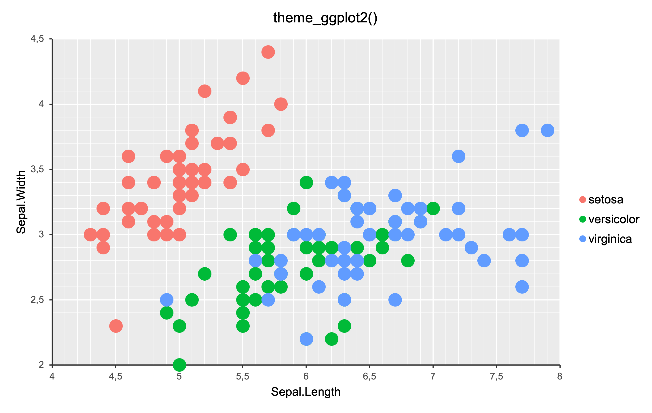
Examples
p <- ms_scatterchart(
  data = iris, x = "Sepal.Length",
  y = "Sepal.Width", group = "Species"
)

p <- theme_ggplot2(p)
p <- chart_fill_ggplot2(p)
Modify axis and plot labels
Description
Add labels to a chart, labels can be specified for x axis, y axis and plot.
Usage
chart_labels(x, title = NULL, xlab = NULL, ylab = NULL)
Arguments
x |
an |
title, xlab, ylab |
Text to add |
Examples
mylc <- ms_linechart(
  data = browser_ts, x = "date", y = "freq",
  group = "browser"
)
mylc <- chart_labels(mylc,
  title = "my title", xlab = "my x label",
  ylab = "my y label"
)
Modify labels font settings
Description
Specify mappings from levels in the data to displayed text font settings.
Usage
chart_labels_text(x, values)
Arguments
x |
an |
values |
a named list of |
See Also
Other Series customization functions:
chart_data_fill(),
chart_data_line_style(),
chart_data_line_width(),
chart_data_size(),
chart_data_smooth(),
chart_data_stroke(),
chart_data_symbol()
Examples
library(officer)

fp_text_settings <- list(
  serie1 = fp_text(font.size = 7, color = "red"),
  serie2 = fp_text(font.size = 0, color = "purple"),
  serie3 = fp_text(font.size = 19, color = "wheat")
)

barchart <- ms_barchart(
  data = browser_data,
  x = "browser", y = "value", group = "serie")
barchart <- chart_data_labels(barchart, show_val = TRUE)
barchart <- chart_labels_text( barchart,
  values = fp_text_settings )
set chart options
Description
Set chart properties.
Usage
chart_settings(x, ...)

## S3 method for class 'ms_barchart'
chart_settings(x, vary_colors, gap_width, dir, grouping, overlap, table, ...)

## S3 method for class 'ms_linechart'
chart_settings(x, vary_colors, style = "lineMarker", table, ...)

## S3 method for class 'ms_areachart'
chart_settings(
  x,
  vary_colors = FALSE,
  grouping = "standard",
  table = FALSE,
  ...
)

## S3 method for class 'ms_scatterchart'
chart_settings(x, vary_colors = FALSE, style = "marker", ...)
Arguments
x |
an |
... |
unused parameter |
vary_colors |
if |
gap_width |
A gap appears between the bar or clustered bars for each category on a bar chart. The default width for this gap is 150 percent of the bar width. It can be set between 0 and 500 percent of the bar width. |
dir |
the direction of the bars in the chart, value must one of "horizontal" or "vertical". |
grouping |
grouping for a barchart, a linechart or an area chart. must be one of "percentStacked", "clustered", "standard" or "stacked". |
overlap |
In a bar chart having two or more series, the bars for each category are clustered together. By default, these bars are directly adjacent to each other. The bars can be made to overlap each other or have a space between them using the overlap property. Its values range between -100 and 100, representing the percentage of the bar width by which to overlap adjacent bars. A setting of -100 creates a gap of a full bar width and a setting of 100 causes all the bars in a category to be superimposed. The default value is 0. |
table |
if |
style |
Style for the linechart or scatterchart type of markers. One of 'none', 'line', 'lineMarker', 'marker', 'smooth', 'smoothMarker'. |
Methods (by class)
-
chart_settings(ms_barchart): barchart settings -
chart_settings(ms_linechart): linechart settings -
chart_settings(ms_areachart): linechart settings -
chart_settings(ms_scatterchart): linechart settings
Illustrations
See Also
ms_barchart(), ms_areachart(), ms_scatterchart(), ms_linechart()
Examples
library(mschart)
library(officer)

chart_01 <- ms_barchart(
  data = browser_data, x = "browser",
  y = "value", group = "serie"
)
chart_01 <- chart_theme(chart_01,
  grid_major_line_x = fp_border(width = 0),
  grid_minor_line_x = fp_border(width = 0)
)

chart_02 <- chart_settings(
  x = chart_01,
  grouping = "stacked", overlap = 100
)


chart_03 <- ms_areachart(
  data = browser_ts, x = "date",
  y = "freq", group = "browser"
)
chart_03 <- chart_settings(chart_03,
  grouping = "percentStacked"
)
x table settings
Description
Define settings for an x table.
Usage
chart_table(x, horizontal, vertical, outline, show_keys)
Arguments
x |
an |
horizontal |
write horizontal lines in the table |
vertical |
write vertical lines in the table |
outline |
write an outline in the table |
show_keys |
showkeys in the table |
Examples
data <- data.frame(
  supp = factor(rep(c("OJ", "VC"), each = 3),
                levels = c("OJ", "VC")),
  dose = factor(rep(c("low", "medium", "high"), 2),
                levels = c("low", "medium", "high")),
  length = c(13.23, 22.7, 24.06, 7.98, 16.77, 26.14),
  label = LETTERS[1:6],
  stringsAsFactors = FALSE
)

# example chart 03 -------
chart <- ms_linechart(
  data = data, x = "dose", y = "length",
  group = "supp", labels = "label"
)
chart <- chart_settings(
  x = chart, table = TRUE
)

chart <- chart_table(chart,
  horizontal = TRUE, vertical = FALSE,
  outline = TRUE, show_keys = FALSE
)
areachart object
Description
Creation of an areachart object that can be inserted in a 'Microsoft' document.
Area charts can be used to plot change over time and draw attention to the total value across a trend. By showing the sum of the plotted values, an area chart also shows the relationship of parts to a whole.
Usage
ms_areachart(data, x, y, group = NULL, labels = NULL, asis = FALSE)
Arguments
data |
a data.frame |
x |
x colname |
y |
y colname |
group |
grouping colname used to split data into series. Optional. |
labels |
colnames of columns to be used as labels into series. Optional. If more than a name, only the first one will be used as label, but all labels (transposed if a group is used) will be available in the Excel file associated with the chart. |
asis |
bool parameter defaulting to FALSE. If TRUE the data will not be modified. |
See Also
chart_settings(), chart_ax_x(), chart_ax_y(),
chart_data_labels(), chart_theme(), chart_labels()
Other 'Office' chart objects:
ms_barchart(),
ms_linechart(),
ms_scatterchart()
Examples
library(officer)
mytheme <- mschart_theme(
  axis_title_x = fp_text(color = "red", font.size = 24, bold = TRUE),
  axis_title_y = fp_text(color = "green", font.size = 12, italic = TRUE),
  grid_major_line_y = fp_border(width = 1, color = "orange"),
  axis_ticks_y = fp_border(width = 1, color = "orange")
)

# example ac_01 -------
ac_01 <- ms_areachart(
  data = browser_ts, x = "date",
  y = "freq", group = "browser"
)
ac_01 <- chart_ax_y(ac_01, cross_between = "between", num_fmt = "General")
ac_01 <- chart_ax_x(ac_01, cross_between = "midCat", num_fmt = "m/d/yy")
ac_01 <- set_theme(ac_01, mytheme)


# example ac_02 -------
ac_02 <- chart_settings(ac_01, grouping = "percentStacked")

# example ac_03 -------
ac_03 <- chart_settings(ac_01, grouping = "percentStacked", table = TRUE)
ac_03 <- chart_table(
  ac_03,
  horizontal = FALSE, vertical = FALSE,
  outline = FALSE, show_keys = TRUE)
barchart object
Description
Creation of a barchart object that can be inserted in a 'Microsoft' document.
Bar charts illustrate comparisons among individual items. In a bar chart, the categories are typically organized along the vertical axis, and the values along the horizontal axis.
Consider using a bar chart when:
The axis labels are long.
The values that are shown are durations.
Usage
ms_barchart(data, x, y, group = NULL, labels = NULL, asis = FALSE)
Arguments
data |
a data.frame |
x |
x colname |
y |
y colname |
group |
grouping colname used to split data into series. Optional. |
labels |
colnames of columns to be used as labels into series. Optional. If more than a name, only the first one will be used as label, but all labels (transposed if a group is used) will be available in the Excel file associated with the chart. |
asis |
bool parameter defaulting to FALSE. If TRUE the data will not be modified. |
Illustrations
See Also
chart_settings(), chart_ax_x(), chart_ax_y(),
chart_data_labels(), chart_theme(), chart_labels()
Other 'Office' chart objects:
ms_areachart(),
ms_linechart(),
ms_scatterchart()
Examples
library(officer)
library(mschart)
library(officer)
# example chart 01 -------
chart_01 <- ms_barchart(
data = browser_data, x = "browser",
y = "value", group = "serie"
)
chart_01 <- chart_settings(
x = chart_01, dir = "vertical",
grouping = "clustered", gap_width = 50
)
chart_01 <- chart_ax_x(
x = chart_01, cross_between = "between",
major_tick_mark = "out"
)
chart_01 <- chart_ax_y(
x = chart_01, cross_between = "midCat",
major_tick_mark = "in"
)
# example chart 02 -------
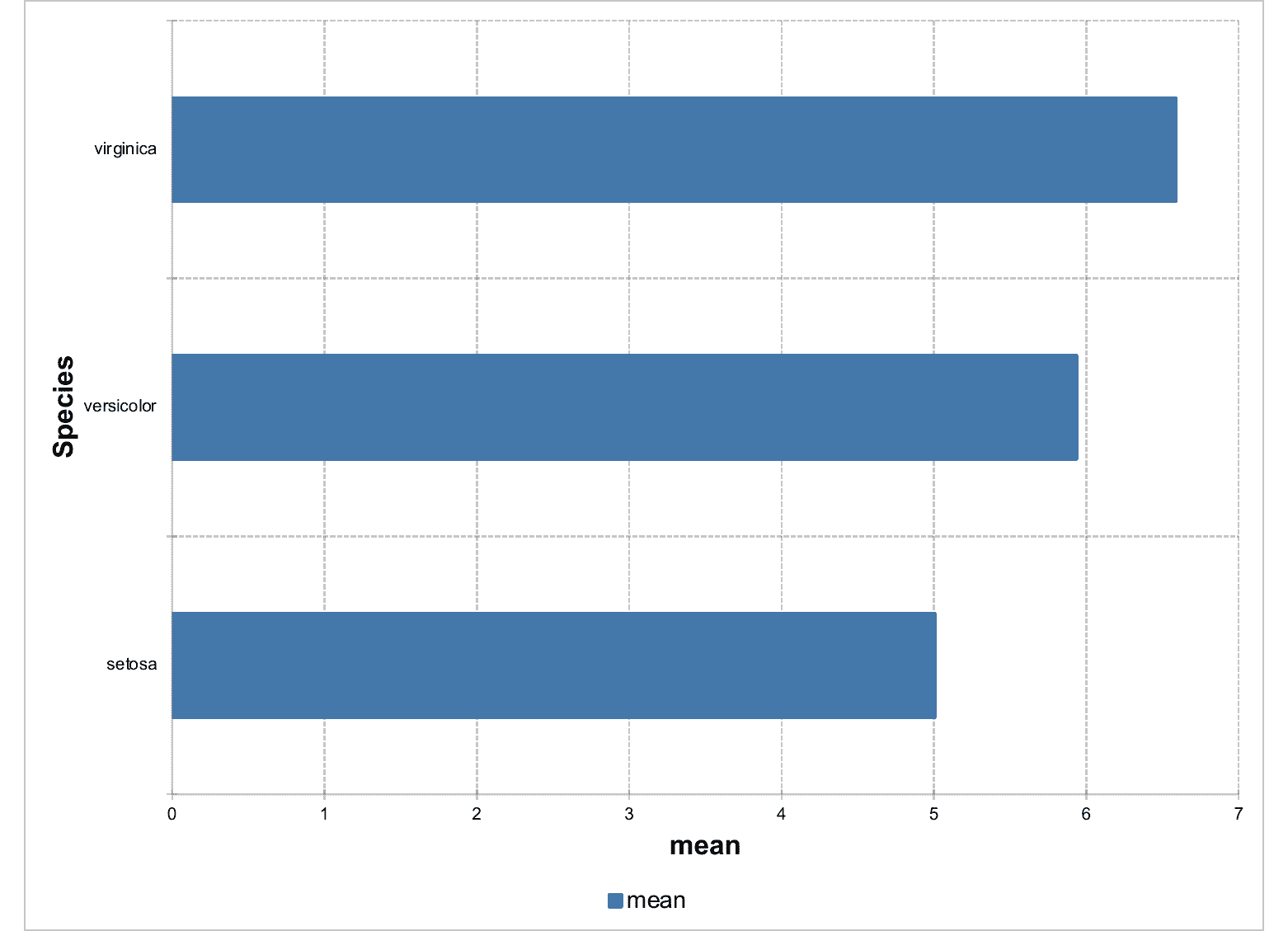
dat <- data.frame(
Species = factor(c("setosa", "versicolor", "virginica"),
levels = c("setosa", "versicolor", "virginica")
),
mean = c(5.006, 5.936, 6.588)
)
chart_02 <- ms_barchart(data = dat, x = "Species", y = "mean")
chart_02 <- chart_settings(x = chart_02, dir = "horizontal")
chart_02 <- chart_theme(x = chart_02, title_x_rot = 270, title_y_rot = 0)
# example chart 03 -------
mytheme <- mschart_theme(
axis_title_x = fp_text(color = "gray", font.size = 20, bold = TRUE),
axis_title_y = fp_text(color = "gray", font.size = 20, italic = TRUE),
grid_major_line_y = fp_border(width = 1, color = "wheat"),
axis_ticks_y = fp_border(width = 1, color = "gray")
)
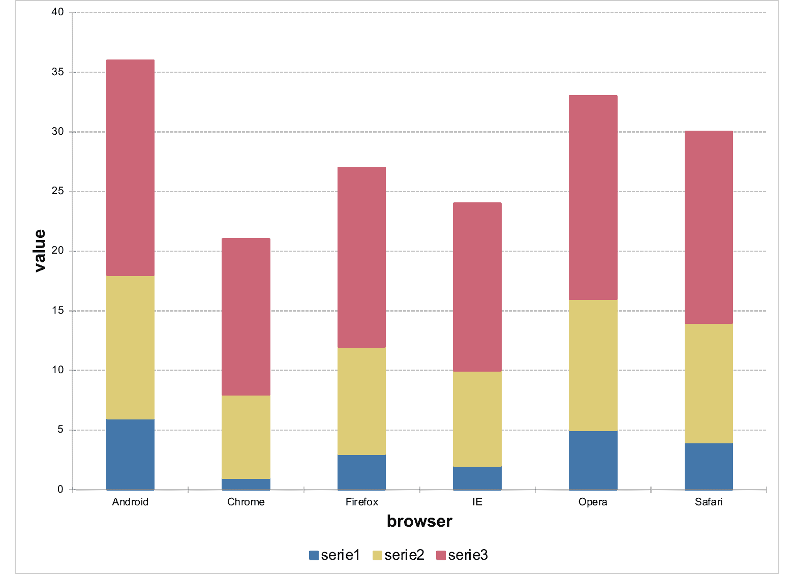
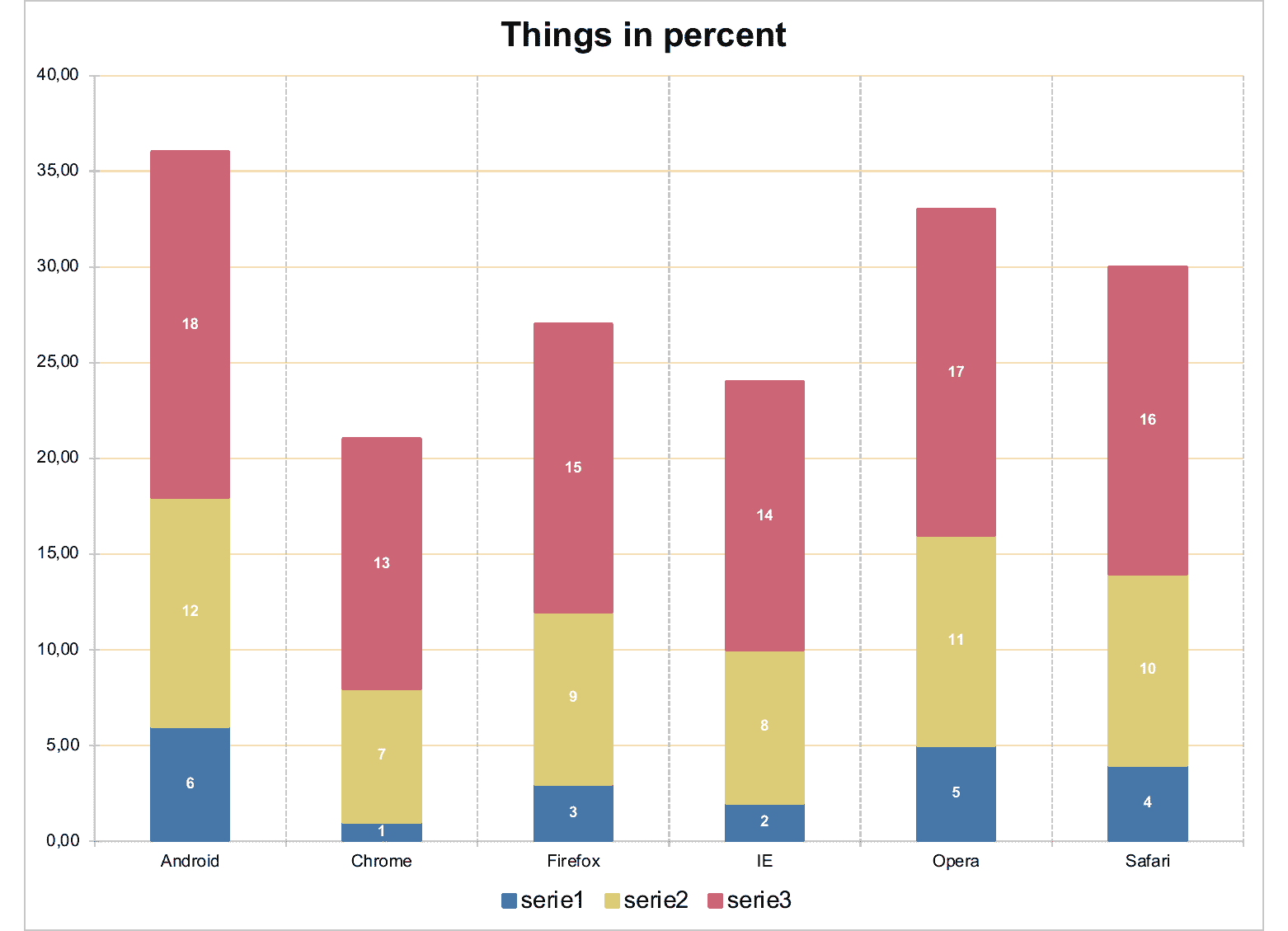
chart_03 <- ms_barchart(
data = browser_data, x = "browser",
y = "value", group = "serie"
)
chart_03 <- chart_settings(chart_03,
grouping = "stacked",
gap_width = 150, overlap = 100
)
chart_03 <- chart_ax_x(chart_03,
cross_between = "between",
major_tick_mark = "out", minor_tick_mark = "none"
)
chart_03 <- chart_ax_y(chart_03,
num_fmt = "0.00",
minor_tick_mark = "none"
)
chart_03 <- set_theme(chart_03, mytheme)
chart_03 <- chart_labels(x = chart_03, title = "Things in percent")
chart_03 <- chart_data_labels(chart_03,
position = "ctr",
show_val = TRUE
)
chart_03 <- chart_labels_text(chart_03, fp_text(color = "white", bold = TRUE, font.size = 9))
# example chart 04 -------
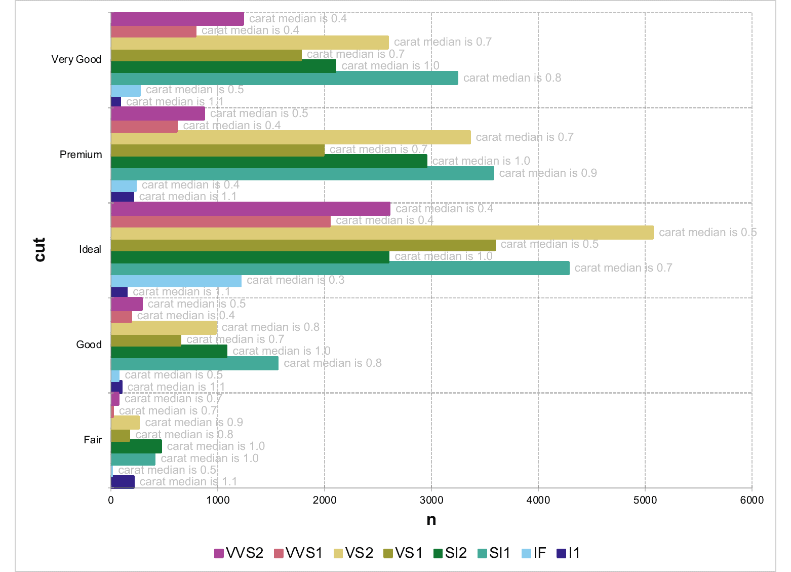
dat_groups <-
data.frame(
cut = c(
"Fair", "Fair", "Fair", "Fair", "Fair",
"Fair", "Fair", "Fair", "Good", "Good", "Good", "Good", "Good",
"Good", "Good", "Good", "Very Good", "Very Good", "Very Good",
"Very Good", "Very Good", "Very Good", "Very Good", "Very Good",
"Premium", "Premium", "Premium", "Premium", "Premium",
"Premium", "Premium", "Premium", "Ideal", "Ideal", "Ideal", "Ideal",
"Ideal", "Ideal", "Ideal", "Ideal"
),
clarity = c(
"I1", "SI2", "SI1", "VS2", "VS1", "VVS2",
"VVS1", "IF", "I1", "SI2", "SI1", "VS2", "VS1", "VVS2", "VVS1",
"IF", "I1", "SI2", "SI1", "VS2", "VS1", "VVS2", "VVS1", "IF",
"I1", "SI2", "SI1", "VS2", "VS1", "VVS2", "VVS1", "IF", "I1",
"SI2", "SI1", "VS2", "VS1", "VVS2", "VVS1", "IF"
),
carat = c(
1.065, 1.01, 0.98, 0.9, 0.77, 0.7, 0.7,
0.47, 1.07, 1, 0.79, 0.82, 0.7, 0.505, 0.4, 0.46, 1.145, 1.01,
0.77, 0.71, 0.7, 0.4, 0.36, 0.495, 1.11, 1.04, 0.9, 0.72, 0.7,
0.455, 0.4, 0.36, 1.13, 1, 0.71, 0.53, 0.53, 0.44, 0.4, 0.34
),
n = c(
210L, 466L, 408L, 261L, 170L, 69L, 17L, 9L,
96L, 1081L, 1560L, 978L, 648L, 286L, 186L, 71L, 84L, 2100L,
3240L, 2591L, 1775L, 1235L, 789L, 268L, 205L, 2949L, 3575L, 3357L,
1989L, 870L, 616L, 230L, 146L, 2598L, 4282L, 5071L, 3589L,
2606L, 2047L, 1212L
)
)
dat_groups$label <- sprintf(
"carat median is %.01f",
dat_groups$carat
)
dat_groups
text_prop <- fp_text(font.size = 11, color = "gray")
chart_04 <- ms_barchart(
data = dat_groups, x = "cut",
labels = "label", y = "n", group = "clarity"
)
chart_04 <- chart_settings(chart_04,
grouping = "clustered", dir = "horizontal",
gap_width = 0
)
chart_04 <- chart_data_labels(chart_04, position = "outEnd")
chart_04 <- chart_labels_text(chart_04, text_prop)
chart_04 <- chart_theme(chart_04, title_x_rot = 270, title_y_rot = 0)
# example chart 05 -------
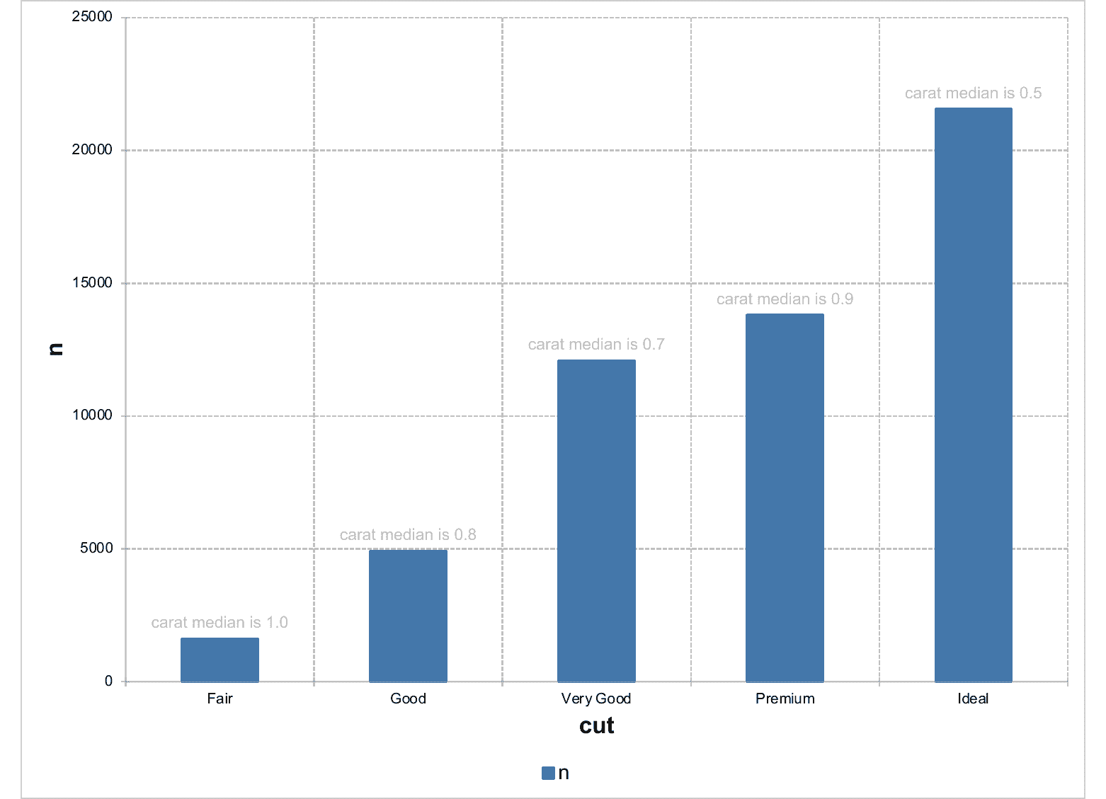
dat_no_group <- data.frame(
stringsAsFactors = FALSE,
cut = c("Fair", "Good", "Very Good", "Premium", "Ideal"),
carat = c(1, 0.82, 0.71, 0.86, 0.54),
n = c(1610L, 4906L, 12082L, 13791L, 21551L),
label = c(
"carat median is 1.0",
"carat median is 0.8", "carat median is 0.7",
"carat median is 0.9", "carat median is 0.5"
)
)
chart_05 <- ms_barchart(
data = dat_no_group,
x = "cut", labels = "label", y = "n"
)
chart_05 <- chart_settings(chart_05,
grouping = "clustered"
)
chart_05 <- chart_data_labels(chart_05, position = "outEnd")
chart_05 <- chart_labels_text(chart_05, text_prop)
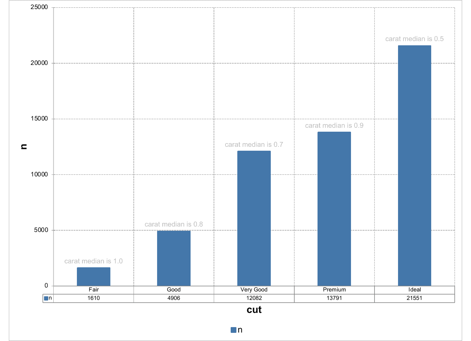
# example chart 06 -------
chart_06 <- ms_barchart(
data = dat_no_group,
x = "cut", labels = "label", y = "n"
)
chart_06 <- chart_settings(chart_06,
grouping = "clustered", table = TRUE
)
chart_06 <- chart_data_labels(chart_06, position = "outEnd")
chart_06 <- chart_labels_text(chart_06, text_prop)
linechart object
Description
Creation of a linechart object that can be inserted in a 'Microsoft' document.
In a line chart, category data is distributed evenly along the horizontal axis, and all value data is distributed evenly along the vertical axis. Line charts can show continuous data over time on an evenly scaled axis, so they're ideal for showing trends in data at equal intervals, like months and quarters.
Usage
ms_linechart(data, x, y, group = NULL, labels = NULL, asis = FALSE)
Arguments
data |
a data.frame |
x |
x colname |
y |
y colname |
group |
grouping colname used to split data into series. Optional. |
labels |
colnames of columns to be used as labels into series. Optional. If more than a name, only the first one will be used as label, but all labels (transposed if a group is used) will be available in the Excel file associated with the chart. |
asis |
bool parameter defaulting to FALSE. If TRUE the data will not be modified. |
Illustrations
See Also
chart_settings(), chart_ax_x(), chart_ax_y(),
chart_data_labels(), chart_theme(), chart_labels()
Other 'Office' chart objects:
ms_areachart(),
ms_barchart(),
ms_scatterchart()
Examples
library(officer)
# example chart_01 -------
chart_01 <- ms_linechart(
data = us_indus_prod,
x = "date", y = "value",
group = "type"
)
chart_01 <- chart_ax_x(
x = chart_01, num_fmt = "[$-fr-FR]mmm yyyy",
limit_min = min(us_indus_prod$date), limit_max = as.Date("1992-01-01")
)
chart_01 <- chart_data_stroke(
x = chart_01,
values = c(adjusted = "red", unadjusted = "gray")
)
chart_01 <- chart_data_line_width(
x = chart_01,
values = c(adjusted = 2, unadjusted = 5)
)
chart_01 <- chart_theme(chart_01,
grid_major_line_x = fp_border(width = 0),
grid_minor_line_x = fp_border(width = 0)
)
# example chart_02 -------
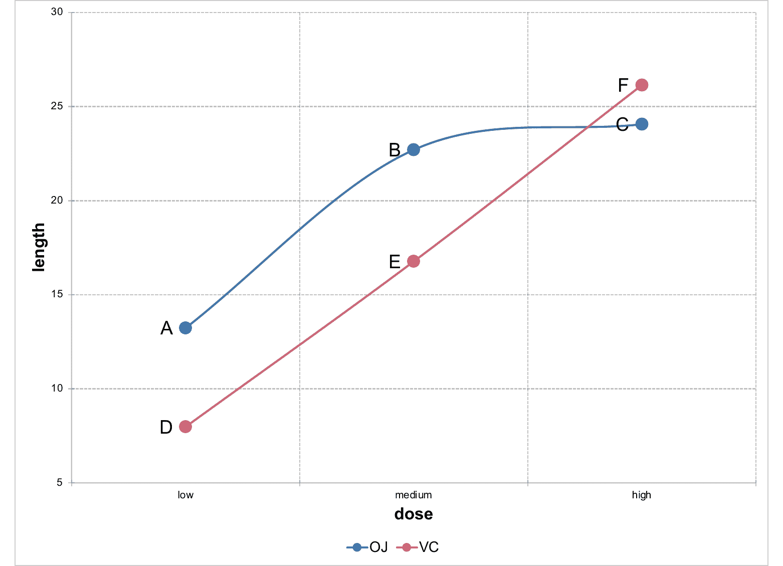
data <- data.frame(
supp = factor(rep(c("OJ", "VC"), each = 3), levels = c("OJ", "VC")),
dose = factor(rep(c("low", "medium", "high"), 2), levels = c("low", "medium", "high")),
length = c(13.23, 22.7, 24.06, 7.98, 16.77, 26.14),
label = LETTERS[1:6],
stringsAsFactors = FALSE
)
chart_02 <- ms_linechart(
data = data, x = "dose", y = "length",
group = "supp", labels = "label"
)
chart_02 <- chart_ax_y(
x = chart_02, cross_between = "between",
limit_min = 5, limit_max = 30,
num_fmt = "General"
)
chart_02 <- chart_data_labels(
x = chart_02, position = "l"
)
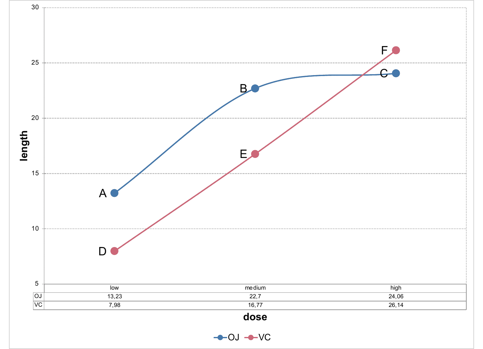
# example chart 03 -------
chart_03 <- ms_linechart(
data = data, x = "dose", y = "length",
group = "supp", labels = "label"
)
chart_03 <- chart_ax_y(
x = chart_03, cross_between = "between",
limit_min = 5, limit_max = 30,
num_fmt = "General"
)
chart_03 <- chart_data_labels(
x = chart_03, position = "l"
)
chart_03 <- chart_settings(
x = chart_03, table = TRUE
)
chart_03 <- chart_table(chart_03,
horizontal = TRUE, vertical = FALSE,
outline = TRUE, show_keys = FALSE
)
scatterchart object
Description
Creation of a scatterchart object that can be inserted in a 'Microsoft' document.
Usage
ms_scatterchart(data, x, y, group = NULL, labels = NULL, asis = FALSE)
Arguments
data |
a data.frame |
x |
x colname |
y |
y colname |
group |
grouping colname used to split data into series. Optional. |
labels |
colnames of columns to be used as labels into series. Optional. If more than a name, only the first one will be used as label, but all labels (transposed if a group is used) will be available in the Excel file associated with the chart. |
asis |
bool parameter defaulting to FALSE. If TRUE the data will not be modified. |
Illustrations
See Also
chart_settings(), chart_ax_x(), chart_ax_y(),
chart_data_labels(), chart_theme(), chart_labels()
Other 'Office' chart objects:
ms_areachart(),
ms_barchart(),
ms_linechart()
Examples
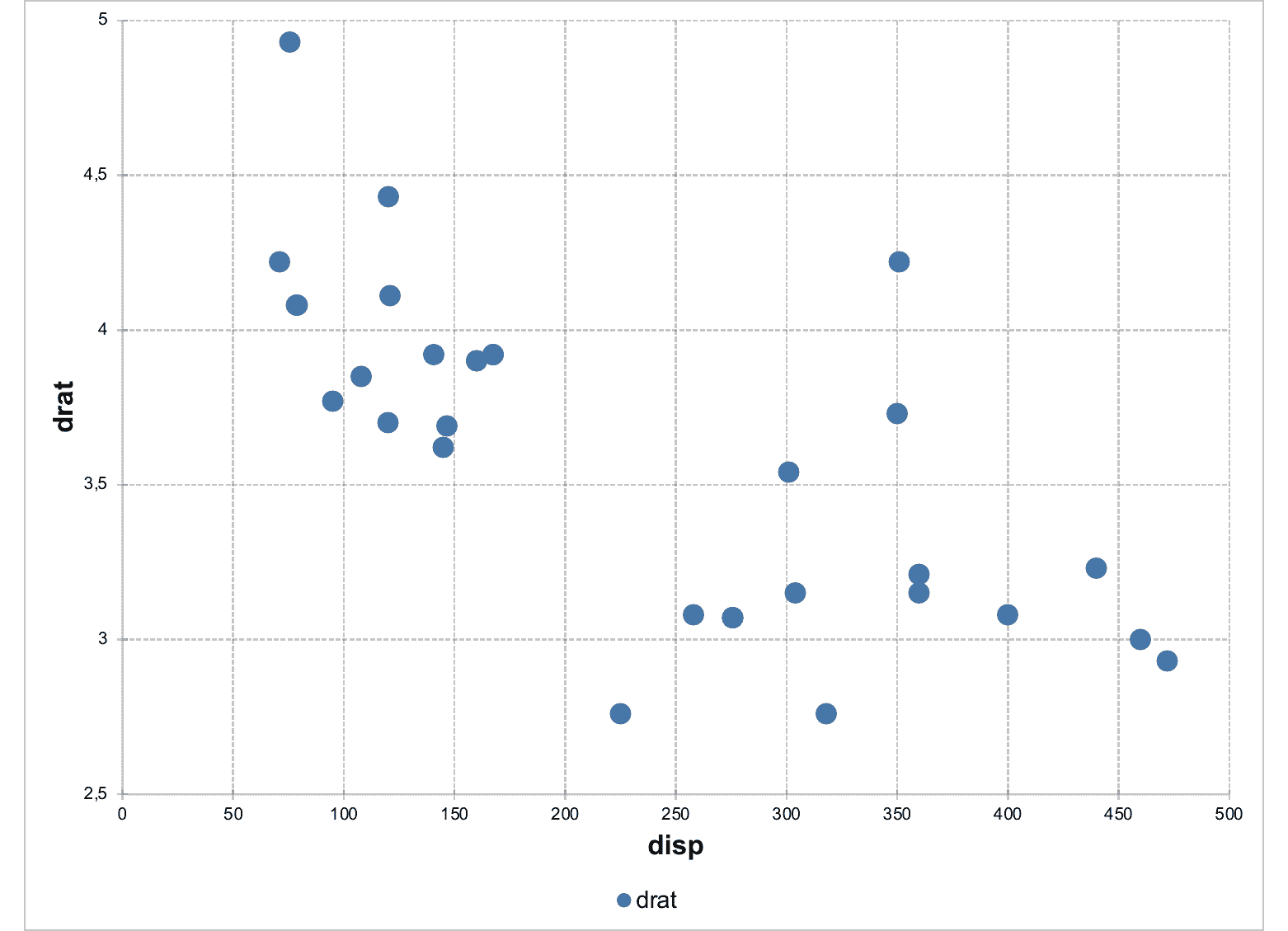
library(officer)
# example chart_01 -------
chart_01 <- ms_scatterchart(
data = mtcars, x = "disp",
y = "drat"
)
chart_01 <- chart_settings(chart_01, scatterstyle = "marker")
# example chart_02 -------
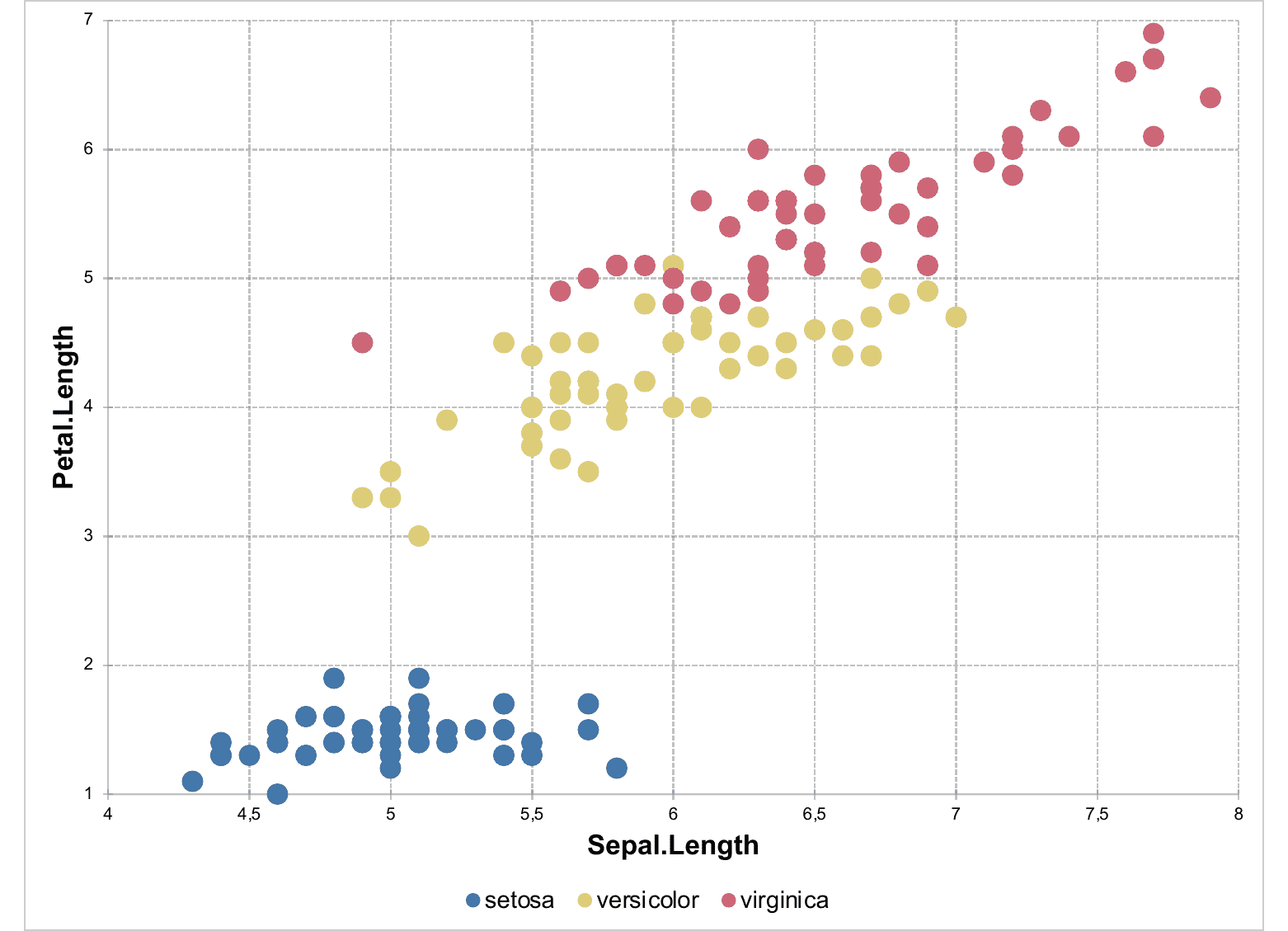
chart_02 <- ms_scatterchart(
data = iris, x = "Sepal.Length",
y = "Petal.Length", group = "Species"
)
chart_02 <- chart_settings(chart_02, scatterstyle = "marker")
add a MS Chart output into a PowerPoint object
Description
produces a Microsoft Chart graphics output from R instructions
and add the result in a PowerPoint document object produced
by officer::read_pptx().
Usage
## S3 method for class 'ms_chart'
ph_with(x, value, location, ...)
Arguments
x |
a pptx device |
value |
chart object |
location |
a location for a placeholder. |
... |
Arguments to be passed to methods. |
Examples
my_barchart <- ms_barchart(data = browser_data,
  x = "browser", y = "value", group = "serie")
my_barchart <- chart_settings( x = my_barchart,
  dir="vertical", grouping="clustered", gap_width = 50 )
my_barchart <- chart_ax_x( x= my_barchart,
  cross_between = 'between', major_tick_mark="out")
my_barchart <- chart_ax_y( x= my_barchart,
  cross_between = "midCat", major_tick_mark="in")

library(officer)
doc <- read_pptx()
doc <- add_slide(doc, "Title and Content", "Office Theme")
doc <- ph_with(doc, my_barchart, location = ph_location_fullsize())

fileout <- tempfile(fileext = ".pptx")
print(doc, target = fileout)
ms_chart print method
Description
an ms_chart object can not be rendered
in R. The default printing method will only display
simple informations about the object.
If argument preview is set to TRUE, a pptx file
will be produced and opened with function browseURL.
Usage
## S3 method for class 'ms_chart'
print(x, preview = FALSE, ...)
Arguments
x |
an |
preview |
preview the chart in a PowerPoint document |
... |
unused |
set chart theme
Description
Modify chart theme with function set_theme.
Use mschart_theme() to create a chart theme.
Use chart_theme() to modify components of the theme of a chart.
Usage
set_theme(x, value)

mschart_theme(
  axis_title = fp_text(bold = TRUE, font.size = 16),
  axis_title_x = axis_title,
  axis_title_y = axis_title,
  main_title = fp_text(bold = TRUE, font.size = 20),
  legend_text = fp_text(font.size = 14),
  table_text = fp_text(bold = FALSE, font.size = 9),
  axis_text = fp_text(),
  axis_text_x = axis_text,
  axis_text_y = axis_text,
  title_rot = 0,
  title_x_rot = 0,
  title_y_rot = 270,
  axis_ticks = fp_border(color = "#99999999"),
  axis_ticks_x = axis_ticks,
  axis_ticks_y = axis_ticks,
  grid_major_line = fp_border(color = "#99999999", style = "dashed"),
  grid_major_line_x = grid_major_line,
  grid_major_line_y = grid_major_line,
  grid_minor_line = fp_border(width = 0),
  grid_minor_line_x = grid_minor_line,
  grid_minor_line_y = grid_minor_line,
  chart_background = NULL,
  chart_border = fp_border(color = "transparent"),
  plot_background = NULL,
  plot_border = fp_border(color = "transparent"),
  date_fmt = "yyyy/mm/dd",
  str_fmt = "General",
  double_fmt = "#,##0.00",
  integer_fmt = "0",
  legend_position = "b"
)

chart_theme(
  x,
  axis_title_x,
  axis_title_y,
  main_title,
  legend_text,
  title_rot,
  title_x_rot,
  title_y_rot,
  axis_text_x,
  axis_text_y,
  axis_ticks_x,
  axis_ticks_y,
  grid_major_line_x,
  grid_major_line_y,
  grid_minor_line_x,
  grid_minor_line_y,
  chart_background,
  chart_border,
  plot_background,
  plot_border,
  date_fmt,
  str_fmt,
  double_fmt,
  integer_fmt,
  legend_position
)
Arguments
x |
an |
value |
a |
axis_title, axis_title_x, axis_title_y |
axis title formatting properties (see |
main_title |
title formatting properties (see |
legend_text |
legend text formatting properties (see |
table_text |
table text formatting properties (see |
axis_text, axis_text_x, axis_text_y |
axis text formatting properties (see |
title_rot, title_x_rot, title_y_rot |
rotation angle |
axis_ticks, axis_ticks_x, axis_ticks_y |
axis ticks formatting properties (see |
grid_major_line, grid_major_line_x, grid_major_line_y |
major grid lines formatting properties (see |
grid_minor_line, grid_minor_line_x, grid_minor_line_y |
minor grid lines formatting properties (see |
chart_background |
chart area background fill color - single character value (e.g. "#000000" or "black") |
chart_border |
chart area border lines formatting properties (see |
plot_background |
plot area background fill color - single character value (e.g. "#000000" or "black") |
plot_border |
plot area border lines formatting properties (see |
date_fmt |
date format |
str_fmt |
string or factor format |
double_fmt |
double format |
integer_fmt |
integer format |
legend_position |
it specifies the position of the legend. It should be one of 'b', 'tr', 'l', 'r', 't', 'n' (for 'none'). |
See Also
ms_barchart(), ms_areachart(), ms_scatterchart(), ms_linechart()
Examples
library(officer)
mytheme <- mschart_theme(
  axis_title = fp_text(color = "red", font.size = 24, bold = TRUE),
  grid_major_line_y = fp_border(width = 1, color = "orange"),
  axis_ticks_y = fp_border(width = .4, color = "gray")
)


my_bc <- ms_barchart(
  data = browser_data, x = "browser",
  y = "value", group = "serie"
)
my_bc <- chart_settings(my_bc,
  dir = "horizontal", grouping = "stacked",
  gap_width = 150, overlap = 100
)
my_bc <- set_theme(my_bc, mytheme)


my_bc_2 <- ms_barchart(
  data = browser_data, x = "browser",
  y = "value", group = "serie"
)
my_bc_2 <- chart_theme(my_bc_2,
  grid_major_line_y = fp_border(width = .5, color = "cyan")
)
Apply ggplot2 theme
Description
A theme that approximates the style of ggplot2::theme_grey.
Usage
theme_ggplot2(x, base_size = 11, base_family = "Arial")
Arguments
x |
a mschart object |
base_size |
base font size |
base_family |
font family |
Value
a mschart object
theme_ggplot2()
Examples
p <- ms_scatterchart(
  data = iris, x = "Sepal.Length",
  y = "Sepal.Width", group = "Species"
)

p <- theme_ggplot2(p)
p <- chart_fill_ggplot2(p)
Index of US Industrial Production
Description
Index of US industrial production (1985 = 100).
Usage
data(us_indus_prod)
Format
A data frame with 256 rows and 3 variables
Details
This is a transformation into simple data.frame
of data USProdIndex in package 'AER'.