---
title: "Visualizing Time Series"
author: "Matt Dancho"
output:
rmarkdown::html_vignette:
toc: true
toc_depth: 2
vignette: >
%\VignetteIndexEntry{Visualizing Time Series}
%\VignetteEngine{knitr::rmarkdown}
%\VignetteEncoding{UTF-8}
---
```{r, include = FALSE}
knitr::opts_chunk$set(
message = FALSE,
warning = FALSE,
fig.width = 8,
fig.height = 4.5,
fig.align = 'center',
out.width='95%',
dpi = 100,
collapse = TRUE,
comment = "#>"
)
```
```{r, echo=FALSE}
knitr::include_graphics("timetk_version_2.jpg")
```
This tutorial focuses on, `plot_time_series()`, a workhorse time-series plotting function that:
- Generates interactive `plotly` plots (great for exploring & shiny apps)
- Consolidates 20+ lines of `ggplot2` & `plotly` code
- Scales well to many time series
- Can be converted from interactive `plotly` to static `ggplot2` plots
## Libraries
Run the following code to setup for this tutorial.
```{r setup}
library(dplyr)
library(ggplot2)
library(lubridate)
library(timetk)
# Setup for the plotly charts (# FALSE returns ggplots)
interactive <- FALSE
```
## Plotting Time Series
Let's start with a popular time series, `taylor_30_min`, which includes energy demand in megawatts at a sampling interval of 30-minutes. This is a single time series.
```{r}
taylor_30_min
```
The `plot_time_series()` function generates an interactive `plotly` chart by default.
- Simply provide the date variable (time-based column, `.date_var`) and the numeric variable (`.value`) that changes over time as the first 2 arguments
- When `.interactive = TRUE`, the `.plotly_slider = TRUE` adds a date slider to the bottom of the chart.
```{r}
taylor_30_min %>%
plot_time_series(date, value,
.interactive = interactive,
.plotly_slider = TRUE)
```
### Plotting Groups
Next, let's move on to a dataset with time series groups, `m4_daily`, which is a sample of 4 time series from the M4 competition that are sampled at a daily frequency.
```{r}
m4_daily %>% group_by(id)
```
Visualizing grouped data is as simple as grouping the data set with `group_by()` prior to piping into the `plot_time_series()` function. Key points:
- Groups can be added in 2 ways: by `group_by()` or by using the `...` to add groups.
- Groups are then converted to facets.
- `.facet_ncol = 2` returns a 2-column faceted plot
- `.facet_scales = "free"` allows the x and y-axis of each plot to scale independently of the other plots
```{r}
m4_daily %>%
group_by(id) %>%
plot_time_series(date, value,
.facet_ncol = 2, .facet_scales = "free",
.interactive = interactive)
```
### Visualizing Transformations & Sub-Groups
Let's switch to an hourly dataset with multiple groups. We can showcase:
1. Log transformation to the `.value`
2. Use of `.color_var` to highlight sub-groups.
```{r}
m4_hourly %>% group_by(id)
```
The intent is to showcase the groups in faceted plots, but to highlight weekly windows (sub-groups) within the data while simultaneously doing a `log()` transformation to the value. This is simple to do:
1. `.value = log(value)` Applies the Log Transformation
2. `.color_var = week(date)` The date column is transformed to a `lubridate::week()` number. The color is applied to each of the week numbers.
```{r}
m4_hourly %>%
group_by(id) %>%
plot_time_series(date, log(value), # Apply a Log Transformation
.color_var = week(date), # Color applied to Week transformation
# Facet formatting
.facet_ncol = 2,
.facet_scales = "free",
.interactive = interactive)
```
### Static ggplot2 Visualizations & Customizations
All of the visualizations can be converted from interactive `plotly` (great for exploring and shiny apps) to static `ggplot2` visualizations (great for reports).
```{r}
taylor_30_min %>%
plot_time_series(date, value,
.color_var = month(date, label = TRUE),
# Returns static ggplot
.interactive = FALSE,
# Customization
.title = "Taylor's MegaWatt Data",
.x_lab = "Date (30-min intervals)",
.y_lab = "Energy Demand (MW)",
.color_lab = "Month") +
scale_y_continuous(labels = scales::label_comma())
```
## Box Plots (Time Series)
The `plot_time_series_boxplot()` function can be used to make box plots.
- Box plots use an aggregation, which is a key parameter defined by the `.period` argument.
```{r}
m4_monthly %>%
group_by(id) %>%
plot_time_series_boxplot(
date, value,
.period = "1 year",
.facet_ncol = 2,
.interactive = FALSE)
```
## Regression Plots (Time Series)
A time series regression plot, `plot_time_series_regression()`, can be useful to quickly assess key features that are correlated to a time series.
- Internally the function passes a `formula` to the `stats::lm()` function.
- A linear regression summary can be output by toggling `show_summary = TRUE`.
```{r}
m4_monthly %>%
group_by(id) %>%
plot_time_series_regression(
.date_var = date,
.formula = log(value) ~ as.numeric(date) + month(date, label = TRUE),
.facet_ncol = 2,
.interactive = FALSE,
.show_summary = FALSE
)
```
## Summary
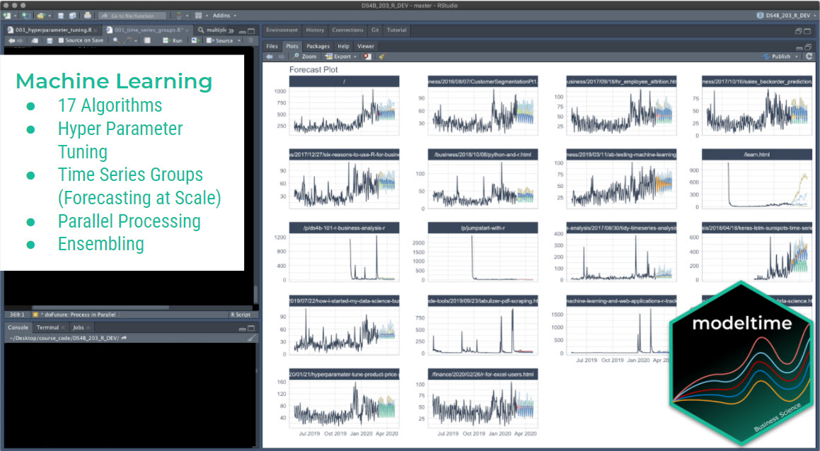
Timetk is part of the amazing Modeltime Ecosystem for time series forecasting. But it can take a long time to learn:
- Many algorithms
- Ensembling and Resampling
- Machine Learning
- Deep Learning
- Scalable Modeling: 10,000+ time series
Your probably thinking how am I ever going to learn time series forecasting. Here's the solution that will save you years of struggling.
# Take the High-Performance Forecasting Course
> Become the forecasting expert for your organization
 [_High-Performance Time Series Course_](https://university.business-science.io/p/ds4b-203-r-high-performance-time-series-forecasting/)
### Time Series is Changing
Time series is changing. __Businesses now need 10,000+ time series forecasts every day.__ This is what I call a _High-Performance Time Series Forecasting System (HPTSF)_ - Accurate, Robust, and Scalable Forecasting.
__High-Performance Forecasting Systems will save companies by improving accuracy and scalability.__ Imagine what will happen to your career if you can provide your organization a "High-Performance Time Series Forecasting System" (HPTSF System).
### How to Learn High-Performance Time Series Forecasting
I teach how to build a HPTFS System in my [__High-Performance Time Series Forecasting Course__](https://university.business-science.io/p/ds4b-203-r-high-performance-time-series-forecasting). You will learn:
- __Time Series Machine Learning__ (cutting-edge) with `Modeltime` - 30+ Models (Prophet, ARIMA, XGBoost, Random Forest, & many more)
- __Deep Learning__ with `GluonTS` (Competition Winners)
- __Time Series Preprocessing__, Noise Reduction, & Anomaly Detection
- __Feature engineering__ using lagged variables & external regressors
- __Hyperparameter Tuning__
- __Time series cross-validation__
- __Ensembling__ Multiple Machine Learning & Univariate Modeling Techniques (Competition Winner)
- __Scalable Forecasting__ - Forecast 1000+ time series in parallel
- and more.
[_High-Performance Time Series Course_](https://university.business-science.io/p/ds4b-203-r-high-performance-time-series-forecasting/)
### Time Series is Changing
Time series is changing. __Businesses now need 10,000+ time series forecasts every day.__ This is what I call a _High-Performance Time Series Forecasting System (HPTSF)_ - Accurate, Robust, and Scalable Forecasting.
__High-Performance Forecasting Systems will save companies by improving accuracy and scalability.__ Imagine what will happen to your career if you can provide your organization a "High-Performance Time Series Forecasting System" (HPTSF System).
### How to Learn High-Performance Time Series Forecasting
I teach how to build a HPTFS System in my [__High-Performance Time Series Forecasting Course__](https://university.business-science.io/p/ds4b-203-r-high-performance-time-series-forecasting). You will learn:
- __Time Series Machine Learning__ (cutting-edge) with `Modeltime` - 30+ Models (Prophet, ARIMA, XGBoost, Random Forest, & many more)
- __Deep Learning__ with `GluonTS` (Competition Winners)
- __Time Series Preprocessing__, Noise Reduction, & Anomaly Detection
- __Feature engineering__ using lagged variables & external regressors
- __Hyperparameter Tuning__
- __Time series cross-validation__
- __Ensembling__ Multiple Machine Learning & Univariate Modeling Techniques (Competition Winner)
- __Scalable Forecasting__ - Forecast 1000+ time series in parallel
- and more.
Become the Time Series Expert for your organization.
Take the High-Performance Time Series Forecasting Course